Sunday, November 22, 2009

*Studio Photography* - Modifiers used within Studio Sets

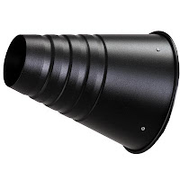
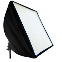
Within our 'Systems & Processes' brief we are required to light a bottle using the following studio light modifiers; soft-box, beauty dish, honeycomb and umbrella.

Taking into consideration that glass bottles are best photographed with light shining from below, I first positioned a large soft box below the opaque white table and positioned another soft box at a 45/45 degree angle.
Although the bottle has overall been well lit, what is most annoying are the reflections of the soft box modifier in the photograph. A job for digital manipulation I think . . . especially as throughout the shoot it hadn't occurred to me, "Why am I using flash whilst photographing a highly reflective surface?" Definitely a brown disguised 'blond' error at that time!

So further more I continued to photograph the glass bottle with the added mistake of allowing the 45/45 degree soft box modifier to flash whilst I was taking the shot and below are the photographic results with the other modifiers advised below - which where positioned behind and above the bottle ;

With a Beauty Dish modifier

With a Honeycomb modifier

With a Umbrella modifier.

Photographing Glass

On 11.11.09 Andy demonstrated to our group how to photograph glass bottles, not always effectively, with the use of different lighting set ups. He advised us all to set our DSLR to ISO 400 using an aperture of F4 where below are all the photographs and notes taken from his lecture;

Set 1 - 45 / 45 degree lighting with a soft box -

Using reflective lighting diffused by a screen will illustrate the reflective quality and natural sheen of the glass by creating highlights

Set 2 - Back lit with a soft box through an opaque curved table -


Back lighting emphasises the translucence of the glass and the features

Set 3 - Back lit and lit from below with soft boxes -


Set 4 - Lit from below with a soft box -


Lighting from below does light the glass part of this perfume bottle very nicely however there is lack of detail present towards to edges and obviously the top of the bottle


Set 5 - Lit with a soft box above, but not directly above


This now gives detail to the top part of the bottle

Set 6 - Lighting at both sides with soft boxes -


Set 7 - Lighting from below, using a reflector above and two side sub tractors -

Using black side sub tractors, which absorb the light, defined the edges of the bottle. The above reflector was used to light up the top of the bottle

This is the same set up as number 7 however you can see that not using the reflector above does not show as much detail at the top of the bottle

Set 8 - Using available light

I placed this aftershave bottle on a window ledge in the university centre, I think natural lighting is always the best to use however the photograph would have been vastly improved if I had used a reflector to light up the front of the bottle, however I do like the composition I used.


My attempts at lighting my own perfume bottle -

From the lecture I gathered that the best type of lighting for bottles is ensuring that you use large diffused light sources, back lighting to emphasise features and to use absorbers at the sides to define the edges of the bottles.


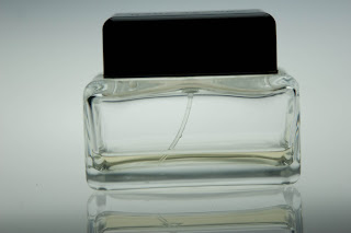
Above are my photographs of my Kate Moss perfume bottle. I used the same set as number 7 and ensured that a reflector was used above to give detail to the top of the black bottle top. I focussed on the glass features such as the 'Kate Moss' logo, the marks, features, shape and colour of the glass rather than the glass itself.

Wednesday, November 18, 2009

*Studio Photography* Lighting Sets

As part of our 'Systems & Processes' brief we are required to provide evidence of rudimentary knowledge and skill in studio lighting. To do this we are asked to photograph a pear or a fruit of our own choice and employ the following lighting techniques; 45 degree / 45 degree, high key, low key, back light and top light.

I decided to take a photograph of an Orange and rather than just using the white curve opaque studio table for my background I used a sheet of blue transparent plastic. My choice of background colour to be blue . . . simply as orange and blue are complimentary colours. I had also been researching on the internet prior to my shoot where I came across an image on http://www.betterphoto.com/ which inspired me to use an Orange with a blue background for this part of the brief. As the image is protected by copyright I am unable to post this to my blogger as evidence for my inspiration however if you go to the website and type in friut in the search engine provided on the site, please view the image titled 'Orange and Blue'.

My 1st photograph is my Orange lit with 45 degree / 45 degree lighting. I positioned the honeycomb at a 45 degree angle from my camera and at a 45 degree angle from the subject / Orange which I was photographing.


You can see from my image that this type of lighting gives three dimensionality and a prominant shadow however the shadow would have been different dependant on the intensity of the light that I decided to use from the honeycomb. It also lights up the majority of the Orange which I felt was a success shooting the orange with a Canon 20D


My 2nd photograph is my Orange attempted to be lit with High Key lighting. Keeping the honeycomb positioned at a 45 / 45 degree angle this being the key light, I positioned a soft box on the other side of my subject and used reflector white boards to rebound the light sources back onto the Orange.


I say attempted as I feel that more accentuated use of lighting would have been more effective in the final image however regardless it still clearly shows the concept of high key lighting which is to dominate the image with bright tones.


After researching on the internet, typing in lighting diagrams via google search engine, I came across this diagram which illustates how to set up a basic high key lighting set


My 3rd photograph is my Orange lit with Low Key lighting. I positioned the honeycombed key light at a 45 degree angle at the side of the subject. I also changed my background using a darker blue cloth material as this would be needed to create a low key effect.

I feel that my attempt to create this effect was successful as low key lighting should dominate the image with dark tones. Through google search engine I came across this diagram which shows the basic set up for low key lighting


My 4th photograph is my Orange lit by back light. I placed a soft box behind the white curved opaque table and reverted back to my original background.


Lighting the Orange with just back light gives a halo of light around the subject. I am very pleased with the finished image as I like the way the transparent blue plastic creates a watery effect, giving the image a surreal feeling like the Orange is floating on water.


My 5th photograph is my Orange lit with Top light. I positioned the soft box directly above the orange but yet again decided to change the background to a black materal for best overall effect.

I like the symplicity of the top lit image. I feel that the gradients of light tones to darker tones through the Orange really make the photograph work well.

Tuesday, November 10, 2009

Large Format Film Processing - Workshop

This evening I attended a workshop led by my course leader, John Harrison, to familiarize myself on how to take pictures using a medium format camera and then to be able to develop the film that I had used.

In the studio John had already set up the Cambo 4x5 monorail large format camera, a image of this type of camera is shown below;
The Cambo 4x5 is used mainly for close up studio work. It is fitted with bag bellows for a wide angle and it has an extensive range of movements. If all three planes, that is the subject plane, the lens plane and the film plane are precisely parallel to each other then a focussed image will appear sharp across the entire image area . If we tilt or swing the 5x4 camera this will alter the depth of focus (depth of field). For a more detailed explanation of the Scheimpflug Principle please see http://en.wikipedia.org/wiki/Scheimpflug_principle

After taking a light metering of our object, a coke bottle which was positioned on a white opaque table, bottom lit by a soft box beneath, it stated to set the camera to F5.6 at 1/2 second shutter speed however knowing that it is advisable to compensate exposure for the loss of light from the lens to the film plane due to the length of the bellows extension, I set the camera at F5.6 at 1 second.

Now time for the red light district (sorry couldn't resist - lol) into the darkroom we went to load our film. The film we used was Hilford Ortho Chromatic ISO 80 Black and White Film and the reason we were able to load this film under red light was due to this film being sensitive to all colours of light . . . APART FROM RED!

A fact sheet advising on all the information of this type of film and how it is to be developed can be found at this website http://www.darkroom.ru/info/manuals/ilford_ortho_manual_eng.pdf

John also mentioned that there was another type of black and white film by Ilford which is called Ilford Pan Chromatic however as this universal film is sensitive to all colours of light he felt that allowing us to load our film in complete darkness, at this early stage, would have been a little cruel. Hmm can't wait for the laughs trying to load this type of film in complete darkness!

After successfully loading our films carefully into the dark slide film holder we where ready to take our photographs, however first things first before emerging back to the studio with our loaded film, John explained the layout of the darkroom to us all and advised us on how to process our films on our return. (See below) As our technitian had already mixed up the necessary chemicals please disregard the information advising how to dilute the 'stock - developer' as this will be attempted by myself at a later date if unfortunately our lovely techician Kevin Howlett is not about the photographic floor;

1. Add to the developer, the left hand side tank ( use 300ml per film )
Stock undiluted - Ilford ID11 - 8 minutes
Stock diluted at 1:1 - Ilford ID11 - 13 minutes - As Kevin had already diluted to this ratio we where advised to develop our negative for this length of time
Another common dilution is 1:3 - 20 minutes

Agitate the tank continuously every 30 seconds
(5 seconds every 30 seconds giving two inversions)

If the tank is under agitated or under developed it will give a low contrast
If the tank is over agitated or over developed it will give a higher contrast

2. Stop Bath - give continuous agitation for 1 minute
3. Fixer - give continuous agitation for 5 minutes
The fixer removes unexposed silver halides. It is an acid called Sodium thiosulphate

4. Wash - in a 'forced' film washer for 20 minutes
5. Photoflo - add a few drops to the final wash and immerse film
Photoflo is a wetting agent used to increase run off, therefore leaving less drying marks

6. Chamois leather - drag down the glossy side of the negative to remove any droplets
7. Dry - hang the negative in a drying cabinet for 30 minutes

Printing from our negatives is to follow in our next weeks workshop

Wednesday, October 28, 2009

Characteristics of Lighting *Research*

There are two main types of lighting within photography, natural and artificial, both of which have certain characteristics that will greatly affect the quality of our photographs. These characteristics are intensity, quality, direction, contrast, colour and unevenness.

The intensity of the light is the quality or brightness of the light shining onto the subject. The quality of the light is seen by the type of shadows formed / cast on and around the subject.

Hard Shadow - sharp direct light source, i.e. the un-obscured sun or snoot


Soft Shadow - large source of light usually from above, i.e. the cloudy sky or a soft box


As a photographer I must measure the intensity of the light to determine the lighting ratio of the scene. The lighting ratio is the difference in intensity between the areas that receive the most light and the area that receives the least.

If a studio is lit with the use of bright lights then the ratio should be high where as if a studio is lit with dim lights then the ratio should be lower.

The lighting ratio affects the degree of contrast within a photograph; a high ratio should produce sharp images with strong contrasting light and dark tones where a low ratio should create softer images with a wider range of medium tones.

Looking in more detail into the differences in lighting ratio's within a studio environment I found this site to be very informative http://www.professionalphotography101.com/portrait_lighting/light_ratios.html

(TIP If taking colour photographs a high lighting ratio may make some colours appear either faint or excessively dark therefore it is best not to overpower the subject with light if a high quality and trueness of the colour is to be seen in the final image)

The colour of light can also vary according to its source although the human eye can't always detect this as the variations appear invisible to us. Ordinary light bulbs produce a reddish light and fluorescent light is basically blue-green. Variations in the colour of light produce a wide variety of effects in colour pictures, we can control these effects by using colour filters on the camera lens or using different colour settings on a DSLR, or colour film that is designed for different types of indoor lighting if using a SLR (film) camera.

Wednesday, October 21, 2009

Using available light & differences of lighting settings on a DSLR

On 14/10/09 Andrew Farrington set up various sets within the photography studio to demonstrate how natural light falls on a subject and to show the differences when taking a photograph using a different colour balance on a DSLR. Unfortunately to date oneself does not own a DSLR camera (as yet!) so I therefore teamed up with Gemma McAuley and below are the pictures obtained from the demonstration and notes taken from the lecture;

Set 1 - Lighting via a window on the subjects left hand side (the photographers right)
DSLR set at 1/125, F4.5 @ 400ISO DSLR set at 1/125, F5.6 @ 800ISO
White Balance Tungsten (Incandescent) Tungsten
Set 2 - Lighting via a window on the subjects left hand side (the photographers right) with a reflector on the subjects right (photographer's left hand side)
DSLR set at 1/125, F5.6 @ 800ISO

White Balance (Daylight)


Set 3 - Lighting via a window behind the subject using reflectors in front as shown below:
DSLR set at 1/125, F5.6 @ 800ISO
White Balance

Lighting via a window behind the subject (No reflectors)
DSLR set at 1/125, F5.6 @ 800ISO

White Balance

Set 4 - Lighting via a window 'Above' the subject
DSLR set at 1/125, F5.6 @ 800ISO

Camera pointing down Camera pointing straight
White Balance White Balance

Camera pointing down Camera pointing down
Shady Cloudy

Set 5 - Lighting using a 5500K Fluorescent daylight tube on the right hand side of the subject ( the photographers left)
DSLR set at 1/125, F5.6 @ 800ISO

Tungsten Shady Cloudy

Set 6 - Lighting using a 5500K Fluorescent daylight tube under the subjects face
DSLR set at 1/125, F5.6 @ 800ISO

Cloudy


Thursday, October 15, 2009

Studio Lighting

On Wednesday 07.10.09, Andrew Farrington welcomed his 2nd group of new Photographic Media Foundation Degree students into the studio on the 4th floor of the new and very impressive University Centre at Blackburn College. His role of the day being to demonstrate the differences in lighting techniques within a photographic studio.

Using a fellow student, Ryan as our model, we paired up into groups of three, to take pictures of him using different lighting set ups as shown below;

Set 1 - Using a soft box at 45 degree face height
DSLR set at 1/125, F5.6 @ 100ISO using white balance 5500
(TIP: Using a higher white balance will give a warmer effect on paler skin)


Set 2 - Using a soft box at 45 degree above face height
DSLR set at 1/125, F5.6 @ 100ISO using white balance 5500


Set 3 - Using a soft box at the side above face height with apposite reflector
DSLR set at 1/125, F5.6 @ 100ISO using white balance 5500


Set 4 - Using a soft box 45 degree behind and above face height with a sub tractor
DSLR set at 1/125, F5.6 @ 100ISO using white balance 5500
(TIP: This separates the subject from the background)


Set 5 - Using a soft box 45 degree behind and 45 degree in front above face height with a sub tractor
DSLR set at 1/125, F5.6 @ 100ISO using white balance 5500


Set 6 - Using a soft box in front and above face height with two side sub tractors
DSLR set at 1/125, F6.7 @ 100ISO using white balance 5500


Set 7 - Using a soft box above head (Top Light) in wrong position with two side
sub tractors
DSLR set at 1/125, F5.6 @ 100ISO using white balance 5500


Set 8 - Using a soft box above head (Top Light) in wrong position with two sub tractors and a under face reflector
DSLR set at 1/125, F5.6 @ 100ISO using white balance 5500


Set 9 - Using a soft box above head (Top Light) in wrong position with two sub tractors, a under face reflector and back light (Back Lit)
DSLR set at 1/125, F5.6 @ 100ISO using white balance 5500